DATA
DATA
DURATION
2 Weeks
DURATION
2 Weeks
CLIENT
Data Tours And Business Solutions
CLIENT
Data Tours And Business Solutions
Brand Identity
Brand Identity
Digital Design
Digital Design
Logo
Logo
Digital Design
Digital Design
PROJECT OVERVIEW
PROJECT OVERVIEW
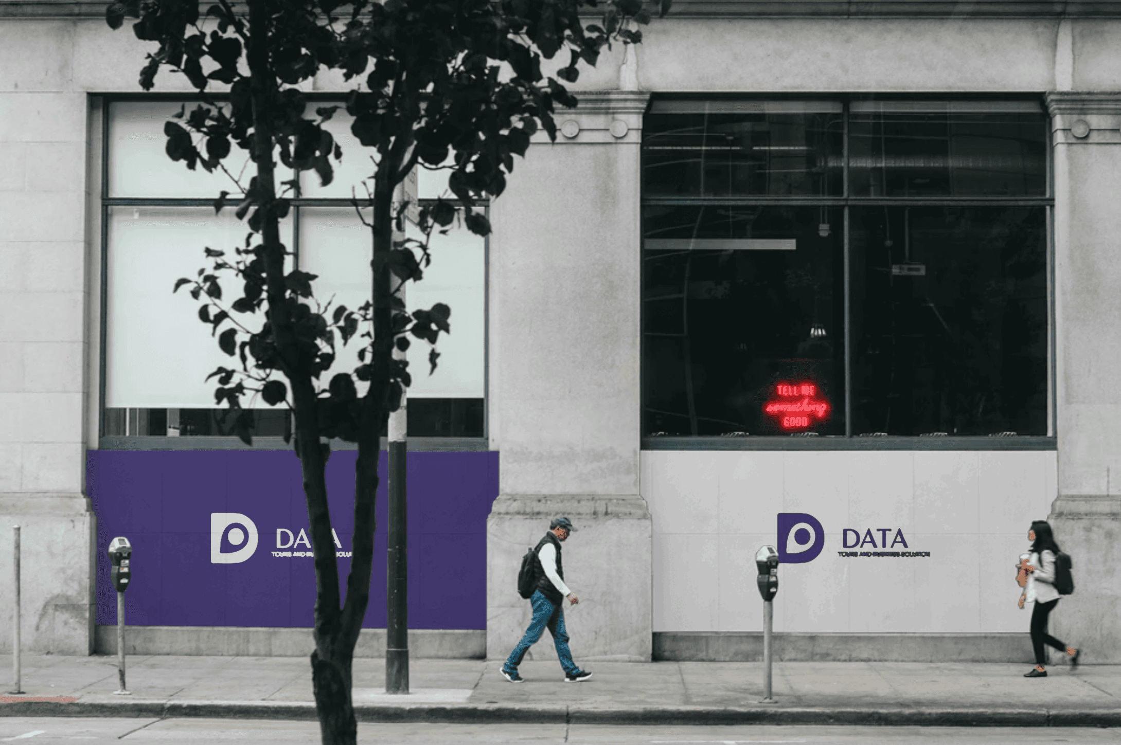
Data is a dynamic business offering travel and tourism services, along with general trading and visa support. The client approached us for a logo and branding package that could reflect the diversity of their offerings — all under one name.
Data is a dynamic business offering travel and tourism services, along with general trading and visa support. The client approached us for a logo and branding package that could reflect the diversity of their offerings — all under one name.
The Challenge
The Challenge
The key challenge was creating a logo that was visually attractive while still clearly communicating the business purpose. The client wanted people to immediately understand that the company deals with tourism, travel assistance, and other essential services, without the identity feeling cluttered or confusing.
The key challenge was creating a logo that was visually attractive while still clearly communicating the business purpose. The client wanted people to immediately understand that the company deals with tourism, travel assistance, and other essential services, without the identity feeling cluttered or confusing.


WHAT WE DID
WHAT WE DID
To solve this challenge, we took a creative approach by using the letter "D" as the foundation for the logo. We stylized it into a symbol that also resembles a map location pin, subtly merging the ideas of travel, tourism, and direction. This design made the logo feel both attractive and meaningful, clearly hinting at the tourism aspect while keeping it sleek and versatile enough to represent the broader range of services the business offers.
To solve this challenge, we took a creative approach by using the letter "D" as the foundation for the logo. We stylized it into a symbol that also resembles a map location pin, subtly merging the ideas of travel, tourism, and direction. This design made the logo feel both attractive and meaningful, clearly hinting at the tourism aspect while keeping it sleek and versatile enough to represent the broader range of services the business offers.

"I needed something that looked good and clearly showed what we do. The team really nailed it. The logo feels right for our travel services and still works well for everything else we offer. It’s clean, simple, and just what we were looking for."
"I needed something that looked good and clearly showed what we do. The team really nailed it. The logo feels right for our travel services and still works well for everything else we offer. It’s clean, simple, and just what we were looking for."
Owner
Owner
Data Tours And Business Solutions
Data Tours And Business Solutions